
Intro - luxe
Gauche
header-cas
video © Lightbulb crew
Challenge
Craft an immersive, instantly readable tactical interface that enables fast decision-making in an asynchronous combat flow, while presering the game’s striking black-white-red aesthetic.
Solution
We designed the Dynamic Timeline and tactical HUD to reveal time, space and consequences in a single glance. Working hand in hand with Lightbulb Crew, we continuously refined icons, feedback and controls until every interaction felt immediate, readable and fully aligned with Othercide’s atmosphere.
A turn based tactical game.
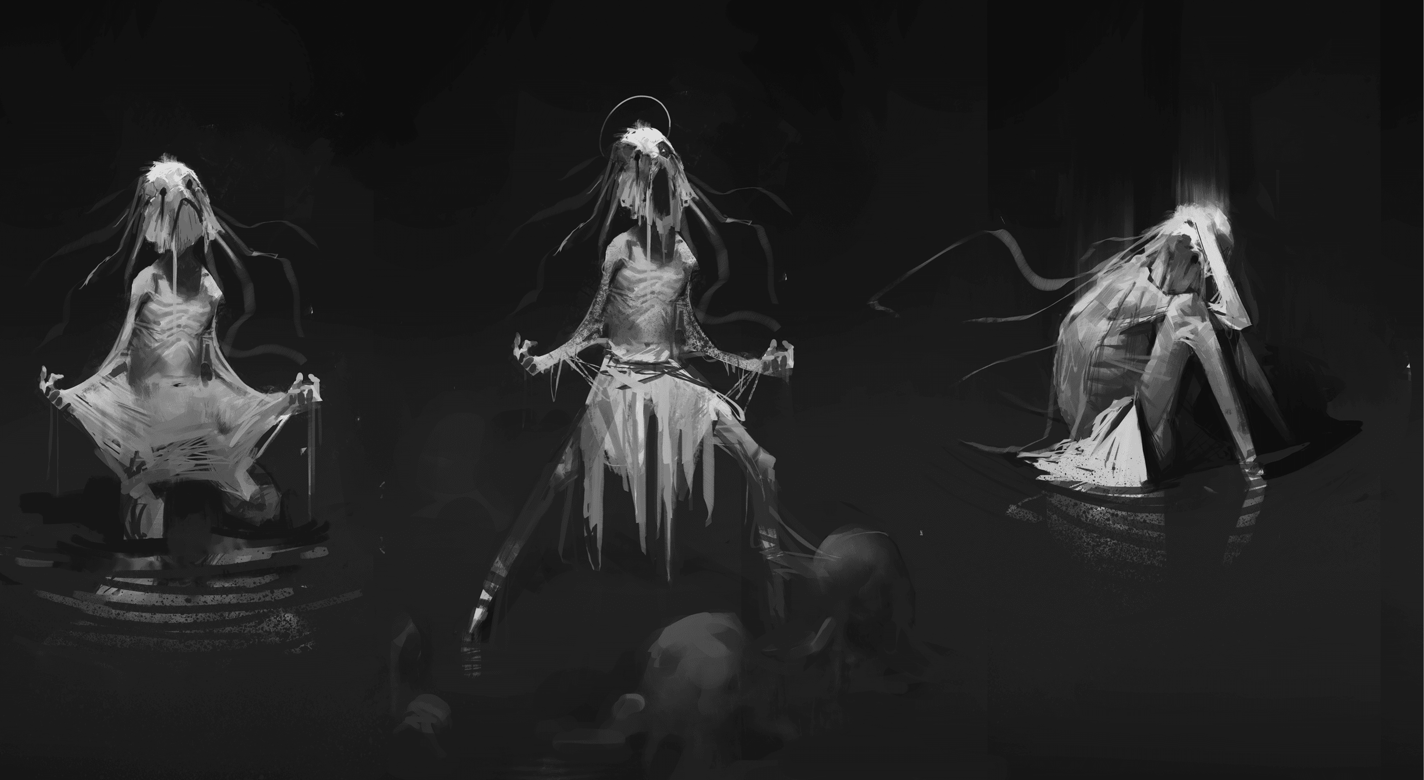
Othercide is a turn based tactical game developed by Lightbulb Crew and published by Focus Home Interactive, released in 2020 on PC, PlayStation 4, Xbox One and Nintendo Switch. It places the player in command of a squad of 3 sisters, called the Daughters, the last fragile line of defense against a nightmarish force known as the Suffering. Every enemy is a manifestation of human trauma, guilt or vice, giving the game its unsettling psychological tone.

First challenge: showing how every action alters time and space.
While traditional turn-based games rely on fixed turns (pick an action, wait, see the result) Othercide true innovation lies in time : every move pushes or pulls the future, reshaping the order of turns, opening opportunities or exposing vulnerabilities. Our first major challenge was to design an interface that makes this relationship between space and time instantly visible. Players must understand how each decision will modify their position on the battlefield and when they will act next, so they can clearly see how their choices reshape what comes after.

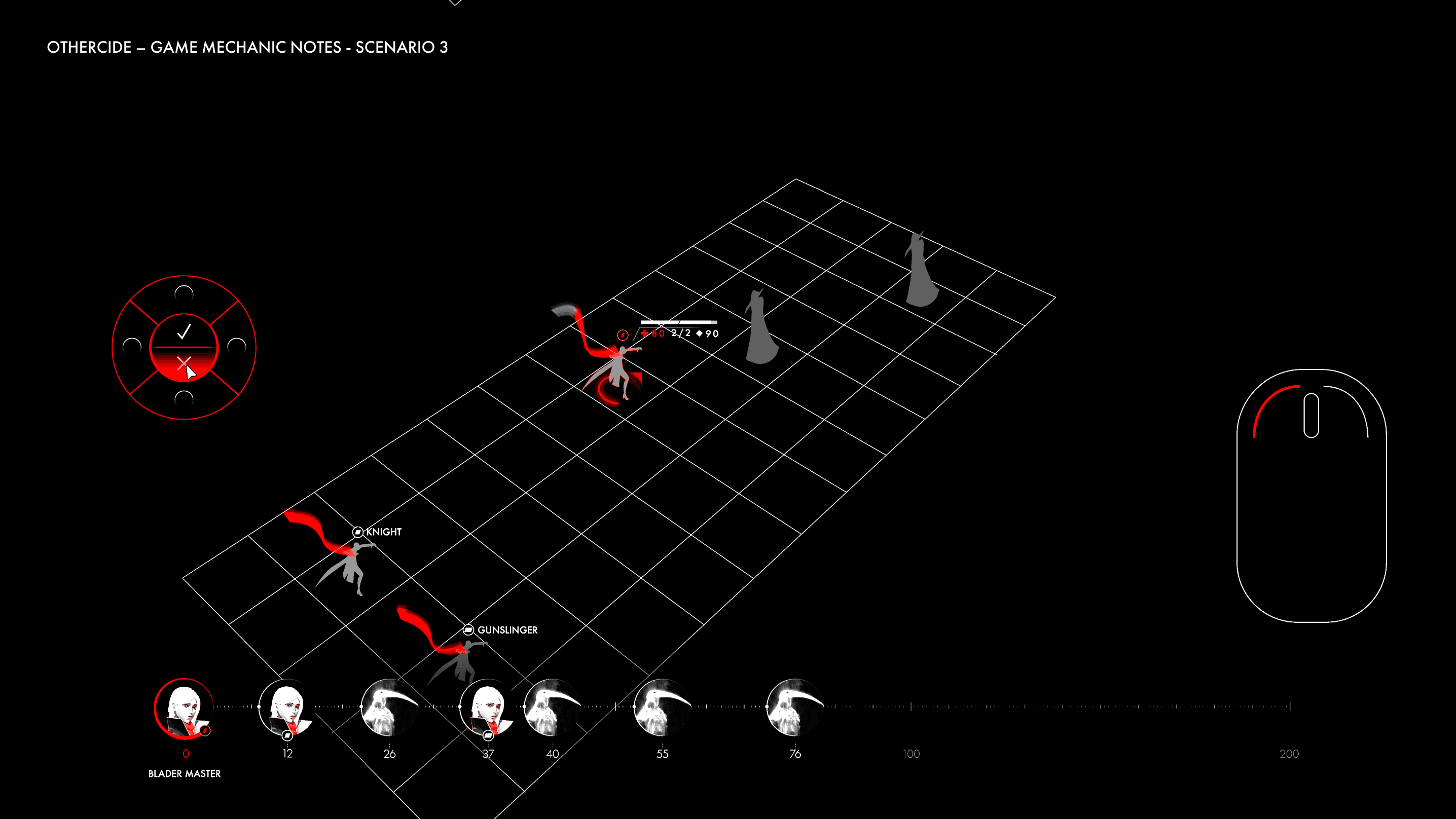
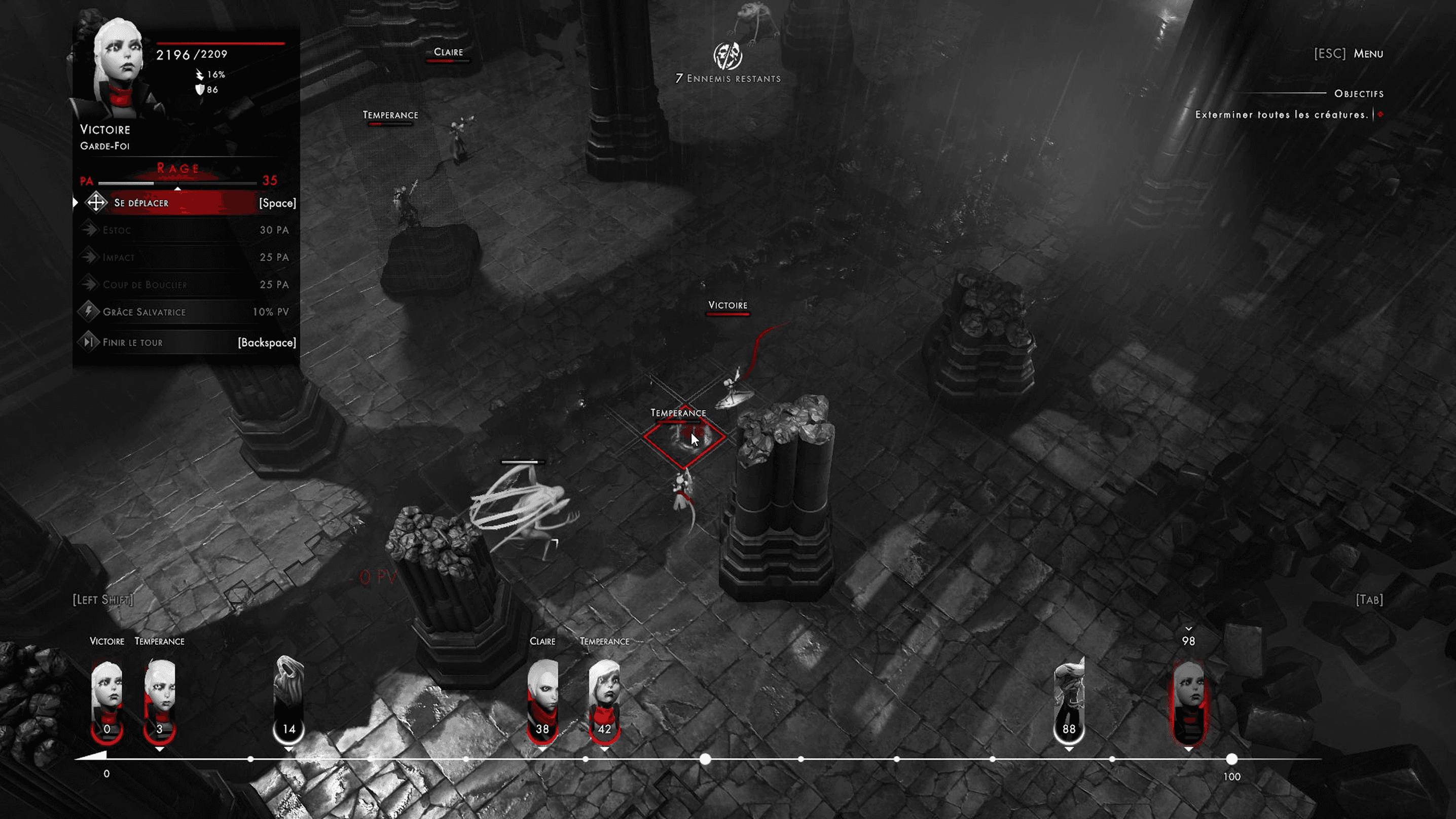
The Dynamic Timeline mechanic.
At the bottom of the screen runs the Dynamic Timeline, a horizontal timeline showing when every unit (allied or enemy) will act next. Player’s choices shift this timeline: spending all action points to eliminate an enemy pushes the Sister’s next turn far back, whereas conserving points brings her back sooner. At times, players can even push an enemy’s turn later on the timeline, letting the Sisters act again before the enemy does. Our task was to make this constantly changing system immediately readable and fully aligned with the game’s monochromatic world. Since tempo is the heart of Othercide’s strategy, we needed to ensure players could instantly understand the consequences of their decisions, the cost of aggression or conservation, and the threat of chain reactions through a timeline that feels both coherent and inseparable from the universe itself.

Second challenge: designing the HUD.
Our second major challenge was redesigning the HUD (Heads-Up Display). In game design, the HUD is the information layer visible during play, without menus or interruptions. In Othercide, it needed to function like a tactical cockpit, giving players everything they require at a glance. Health, orientation, movement possibilities, attack direction and power, plus the shifting position on the timeline all had to be visible at once. The difficulty was maintaining perfect clarity while preserving the game’s visual identity.


An aesthetic drawing from dark fantasy and engraving style horror art.
The game’s aesthetic combines dark fantasy with an engraving style visual language. Everything is built from strong contrasts: deep blacks, sharp whites, and red as the only color, to highlight critical elements such as life, damage or danger. This neo gothic direction defines the entire experience, keeping the world cohesive, immediately readable, and emotionally intense.


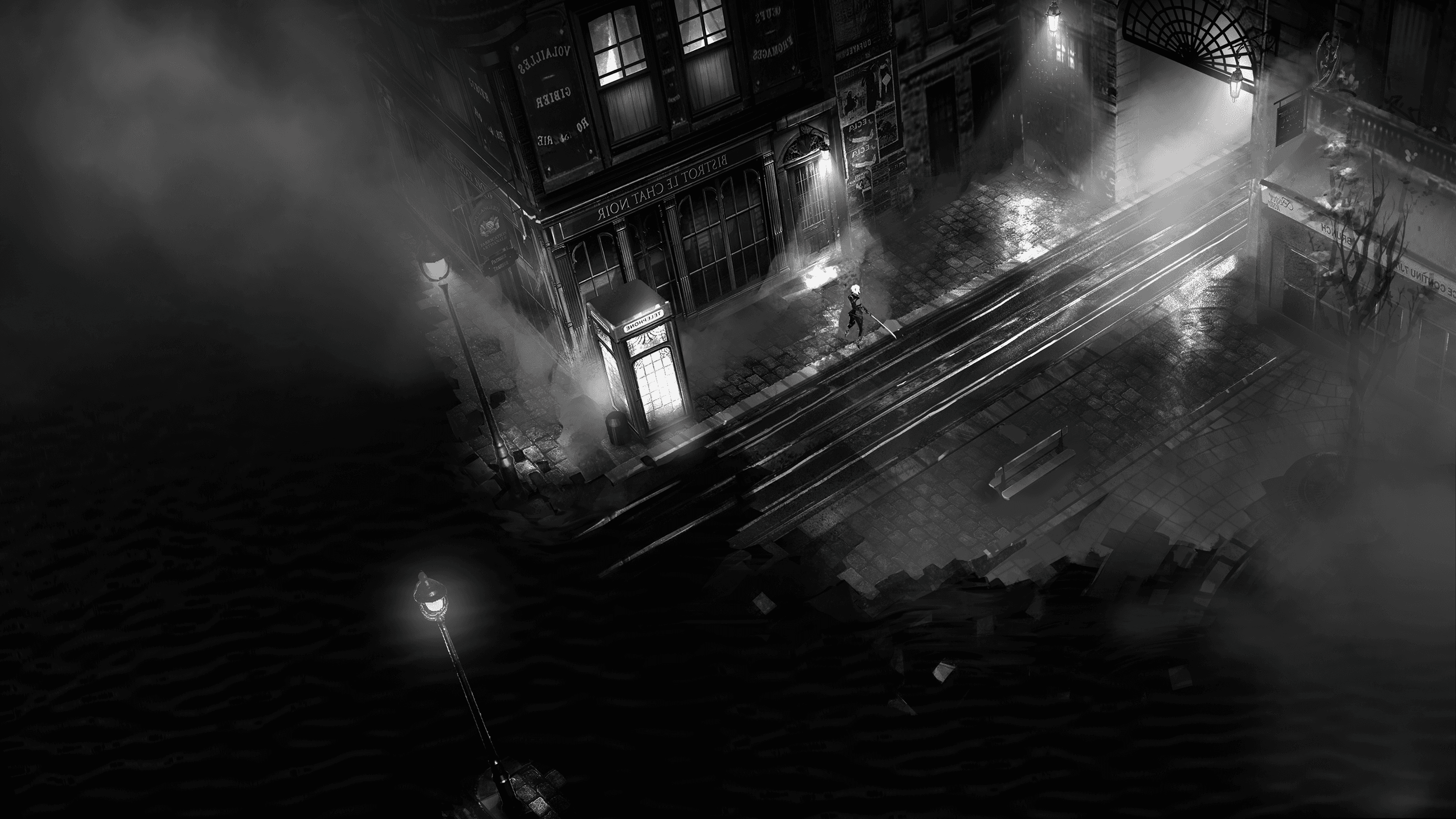
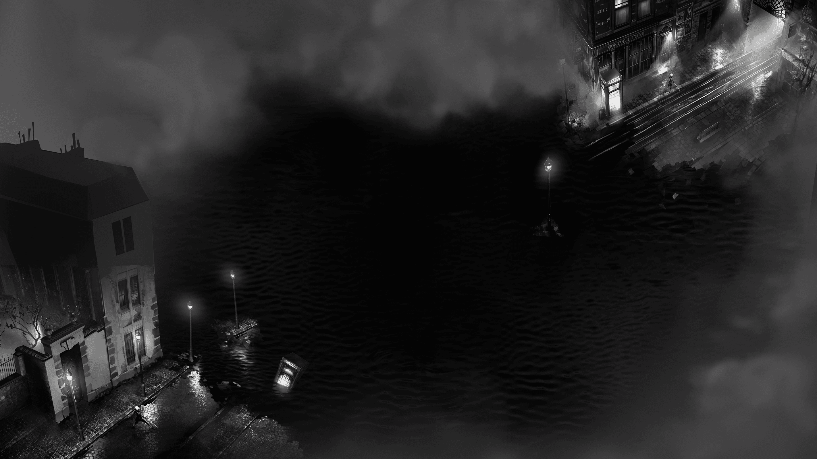


A place in between two worlds.
Othercide is set in a monochromatic, dreamlike version of France, somewhere between 1897 and 1929. The world looks familiar at first, but quickly reveals its instability. Streets bend into impossible shapes, shop signs and text appear mirrored, and everyday architecture feels slightly misaligned, between reality and nightmare. This constant dissonance creates tension: nothing can be fully trusted, and danger feels like it is always just outside the frame. The UI and game assets had to integrate seamlessly into this aesthetic, supporting gameplay without ever breaking the atmosphere.


Crafting attacks information display.
As well as working on the interface, we supported Lightbulb Crew by structuring how attack information is presented to players and how this will affect the Dynamic Timeline. We explored layered feedback, animations, numbers, icons, gauges and lighting cues working together to reinforce meaning and made sure direction, impact, potential damage, and attack strength were clearly and immediately readable at a glance. The attacks themselves were created by Lightbulb Crew.


Health made visible
Each Sister wears a red scarf, as she loses health points, the scarf visibly shortens. That single red thread becomes a visceral indicator of fragility and mortality, forcing the player to feel the vulnerability.


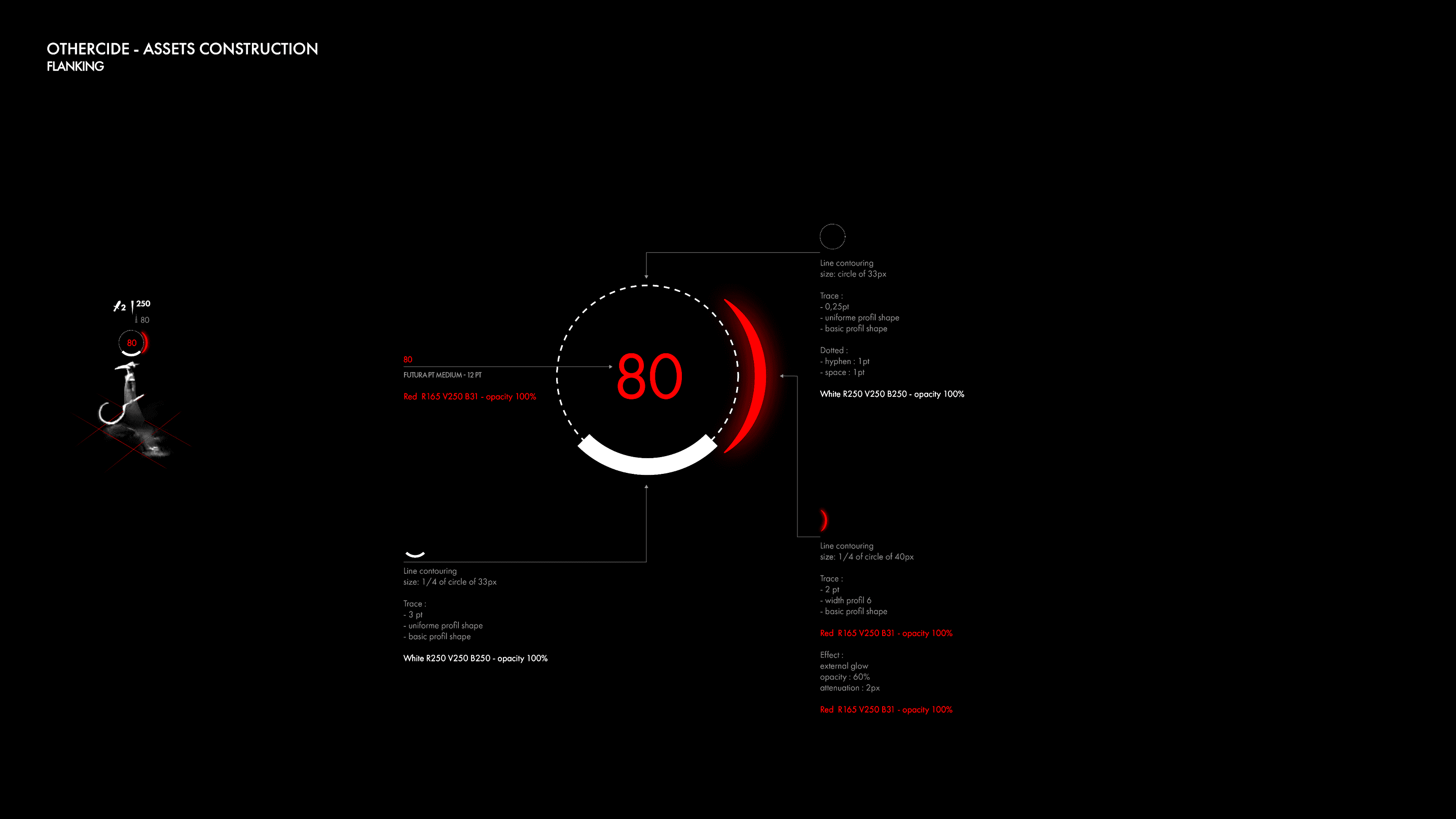
Interface design research
Once we fully grasped the game’s rules, we started our research to create a visual system for the Dynamic Timeline. We explored different interface concepts and overlays, always aiming for clarity and consistency with the game’s atmosphere. Early mockups displayed grid-based movement zones in grey and then red overlays. One version layered movement and attack options directly on the grid overlay, showing in real-time the cost in action points and hinting at the resulting placement on the timeline. The last concept introduced a circular menu, reminiscent of a classic iPod wheel, that players could spin to choose between “move”, “attack”, “move + attack”, etc., then confirm with a central OK button.


Testing readability and usability.
The interface prototypes were tested directly inside the game environment, using real combat situations and enemies. We evaluated readability under pressure, how quickly players understood movement and timing, and whether decisions flowed without breaking immersion. Iterations focused on preserving pace, emotion, and the oppressive atmosphere of Othercide’s world.


Visualizing combat feedback.
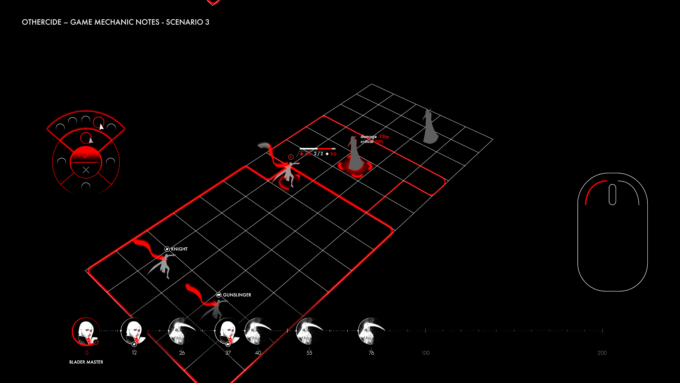
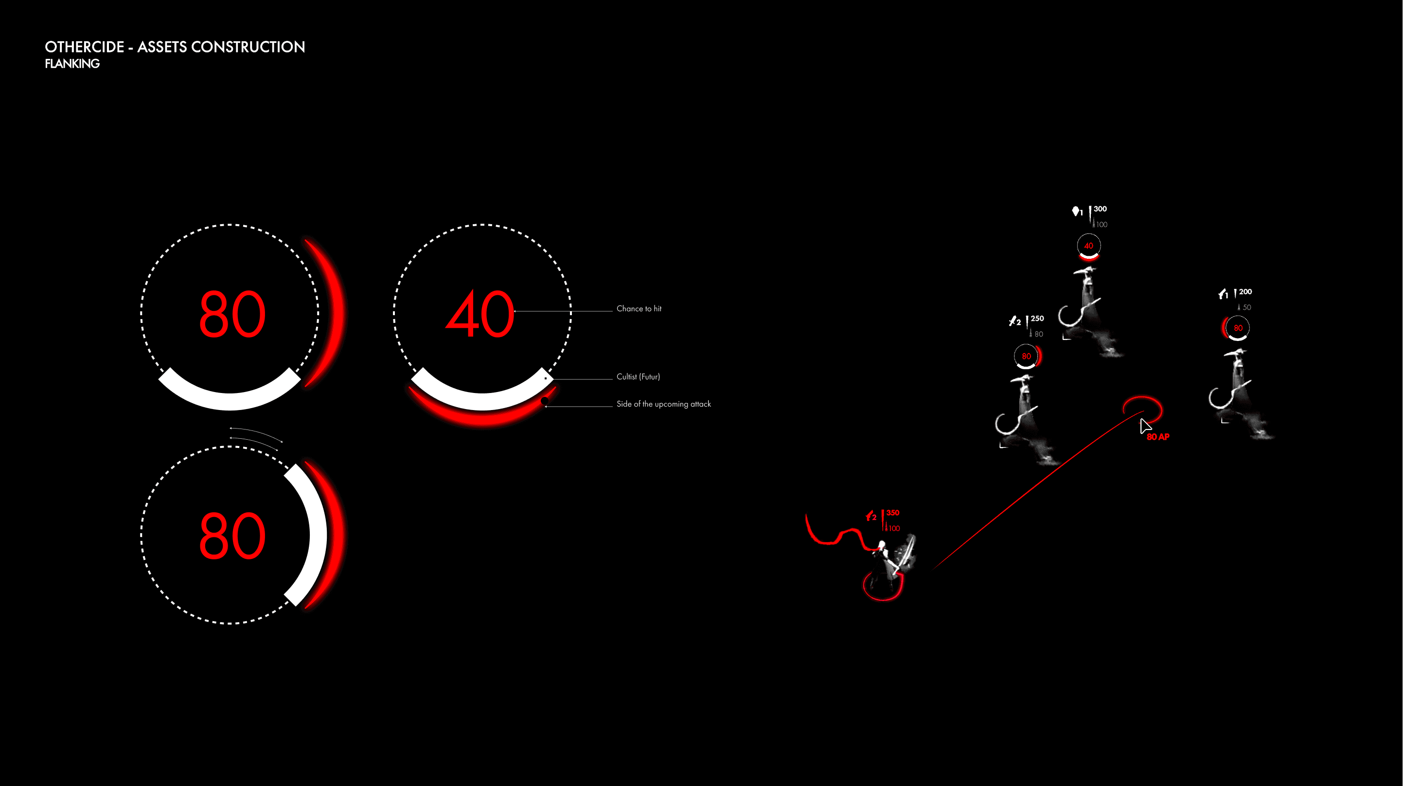
Once the Dynamic Timeline structure was in place, we focused on refining details so players could instantly read the status of each Sister. Attack feedback needed to be spatially intuitive. A number in the center displays the hit chance, while a red half circle indicates the direction and side of impact on the enemy. When a strike lands, the avatar shifts toward red to show damage and increased danger. The goal was to make tactical information feel direct and physical, so understanding the timeline becomes an extension of reading the battlefield.


Visual experiments for health and state indicators
We explored several visual cues to make health and status both clear and emotionally meaningful. One concept used a fire ring around the avatar that burned brightly at full health and visibly shrank as the Sister weakened. A diamond shaped marker indicates once she dropped below fifty percent, signaling a critical threshold. We tested a smoke effect to indicate activity level, with vivid red smoke for active turns and pale grey when waiting. Another option focused on the iconic red scarf, which shortened as health decreased so that damage was visible directly in the battlefield.


Clarifying triggers, delays and interrupts.
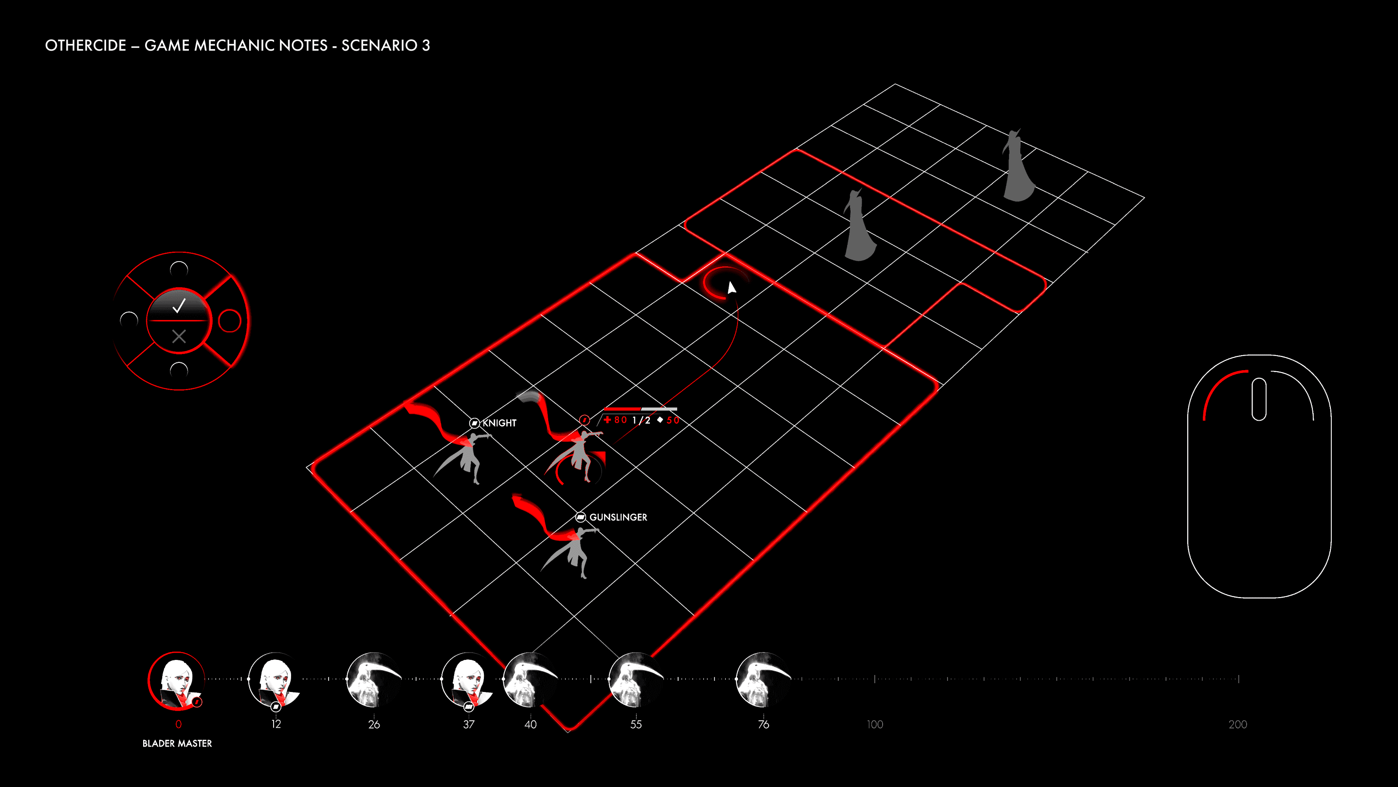
Interrupts, delays and triggered abilities had to be be predictable before the player commits. We tested layered visual cues to show when a delayed action will fire, who it targets, its urgency and its impact on turn order. Translucent portraits differentiated pending actions from standard turns, reducing clutter when the bar becomes crowded. The timeline evolves into a predictive combat map, letting players understand not just turn order, but the consequences they are setting in motion.

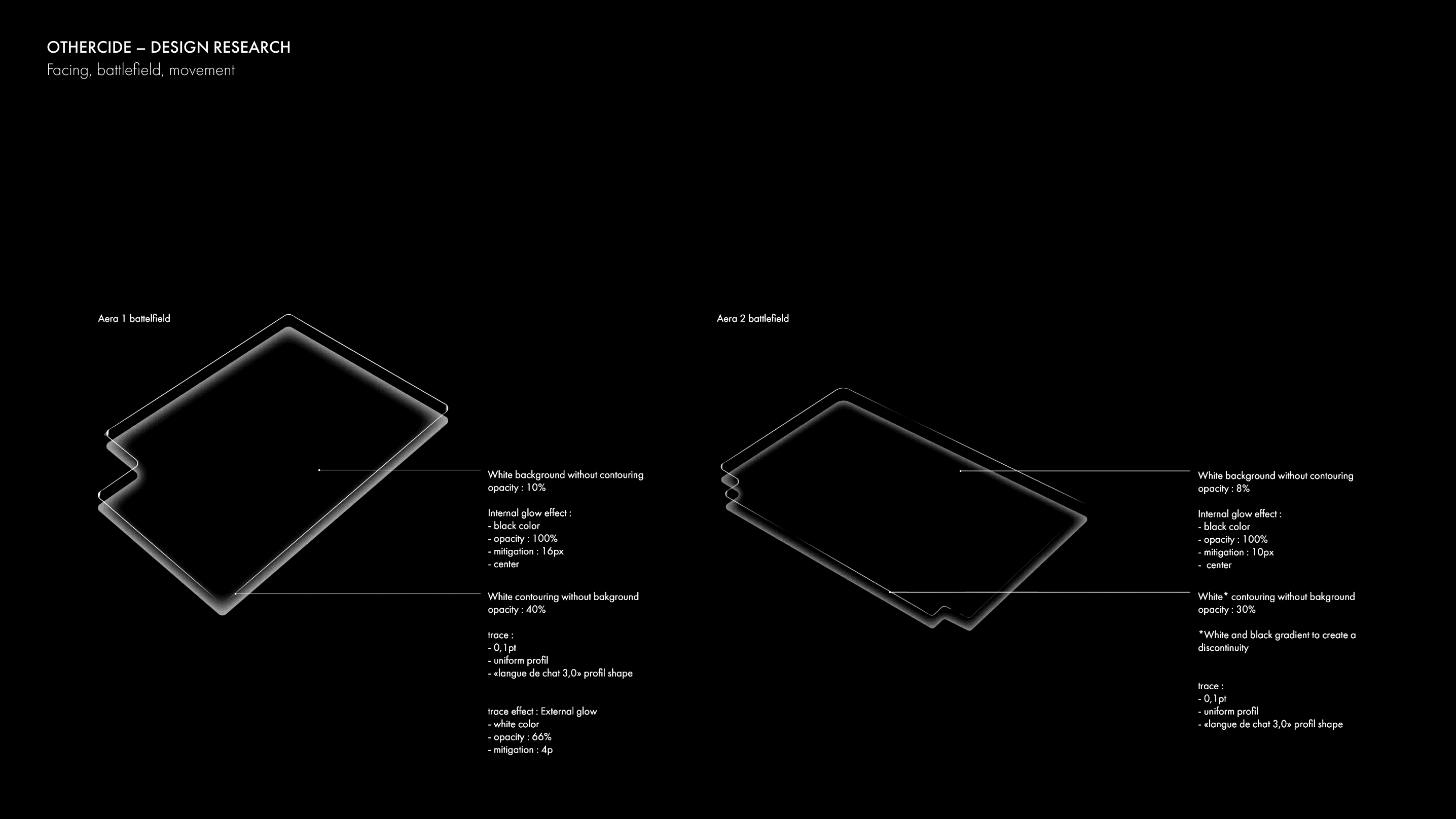


Battelfield and movement.
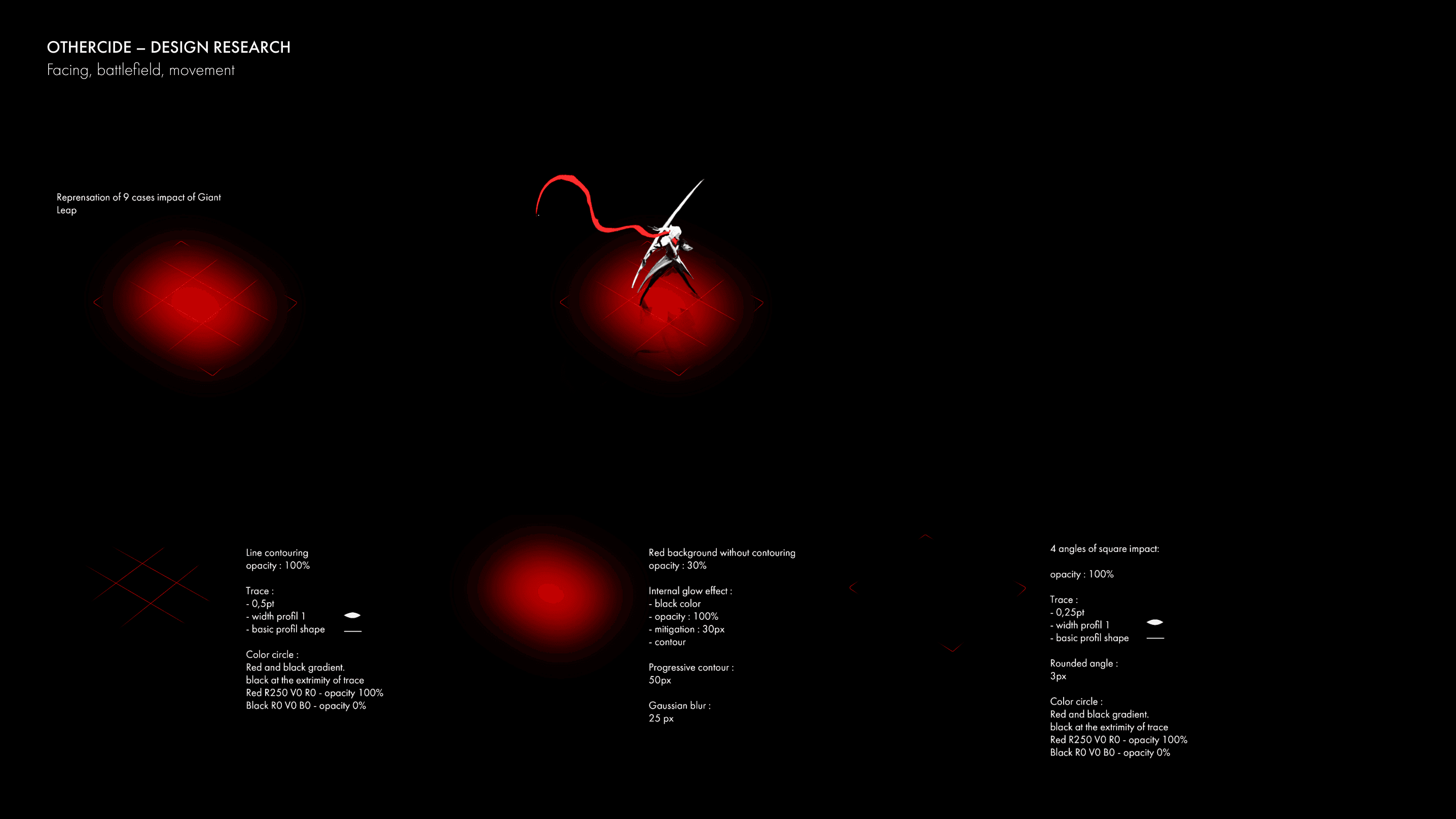
We refined how the battlefield grid communicates impact and mobility: a soft red glow highlights affected tiles while minimal corner markers clarify exact boundaries, and a directional red halo around each Sister indicates where she is about to move. Movement and action traces use precise red lines, changing thickness to distinguish a simple advance, a giant leap or a line of sight. Together, these cues let players assess spatial consequences instantly.

A circular and physical interaction with the UI.
To keep combat fast and intuitive, we designed a circular action menu that players rotate using either a gamepad or a mouse. Each direction selects a different move, attack or end-turn command, while a dedicated confirm input validates the choice. This creates a direct link between physical controls and on-screen strategy.


Testing, again.
We integrated the UI prototypes directly into real gameplay scenes to validate clarity, legibility and tempo. Adjustments were made to preserve immersion, maintain the atmosphere and ensure that every decision remained fast, intuitive and readable in motion.


Final design choices
Eventually, the action menu evolved into a rectangular, minimal panel that does not compete visually with the world. The timeline was reduced to a single thin line with character markers that show both initiative and status. On the battlefield, the grid became simpler and sharper, with light as the main signal of urgency: red highlights indicate danger and critical health while white fades reveal passive or distant units.
Results and learnings
Our AAA experience helped turn a complex tactical system into a clear, responsive interface. Fast iteration and an agile team led to a UI that contributed to the game’s strong critical and public reception.


